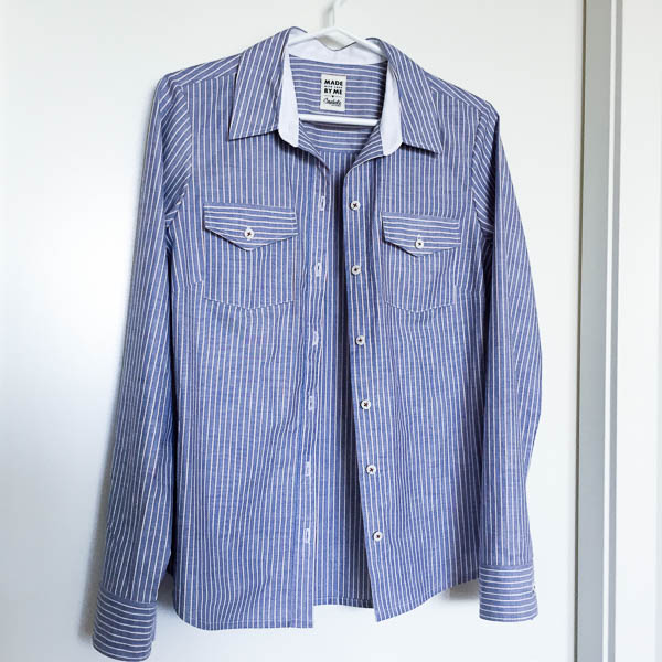
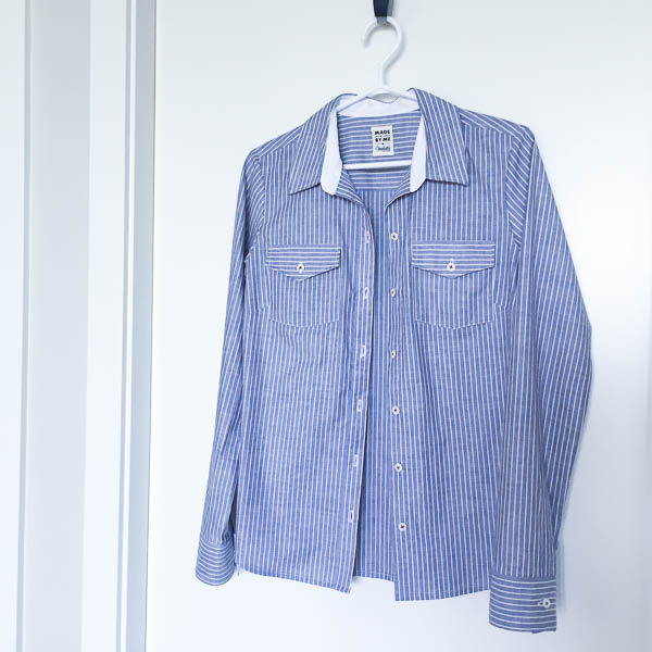
Here’s a Granville Shirt in a striped fabric. This is vintage cotton shirting, bought on Etsy a couple years back. You can tell it’s an older piece of fabric because it’s narrow, only 35″ wide.
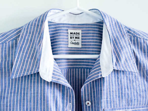
You’ll never see the inner cuff contrast but it’s there!
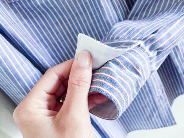
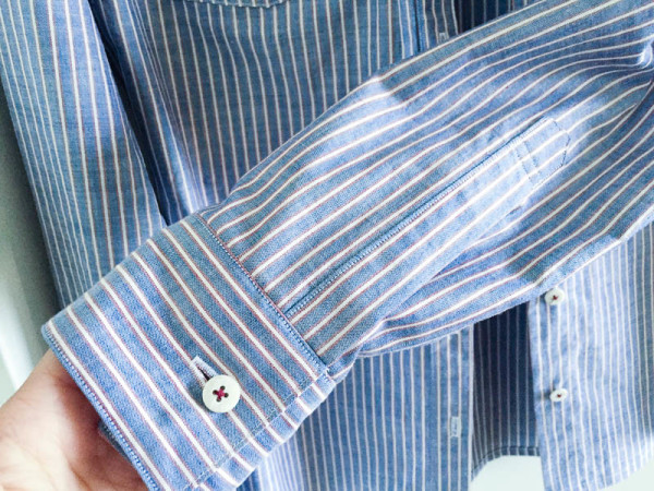
All of the seams are sewn with white thread, so it blends into the white contrast sections, and shows up against the blue stripes.
Tips for Sewing Striped Shirts
Cutting is where the hard work happens. If you take your time with cutting, the sewing part is easier. Also if the cutting isn’t accurate, things can be off from the beginning and it’s hard to recover with sewing and pressing.
Line up the edge of straight pattern pieces with the stripe line. Cut along the stripe (or the space between stripes) as your guide, instead of the pattern piece. It’s sometimes easier to cut one side completely straight first along a stripe, then align the pattern piece along the one flat edge to cut the remaining sides.
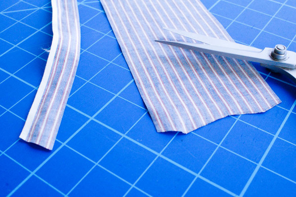
Consider the centre of pattern pieces that are cut on the fold. Do you want your centre to have a stripe down the middle, or a space between two stripes? If there’s a centre notch, use that to line up the pattern piece along the stripes.
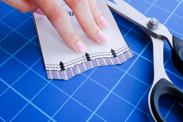
Decide if you want stripes on the small pieces to match the stripe direction on the body, or change direction. You could print out one of the line drawings and sketch in your stripe placement, to get an idea of what it might look like!
When pressing under pocket edges, line up the edge with a stripe. It’s more important to have the stripe line accurate than maintaining the dimensions of the piece. Of course if it’s cut on the stripe edge, you’ll have no problem.
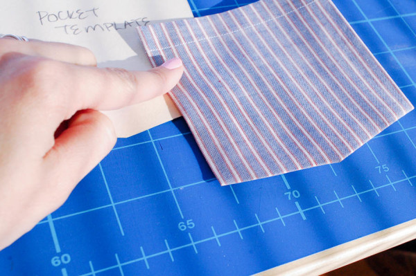
Stripes can make it easier to line up things like patch pockets. I’m using the space between the stripes to line up this patch pocket and ensure it’s parallel to the front opening. It’s off on the dart side, but that’s less important. More important to have it lined up near centre front!
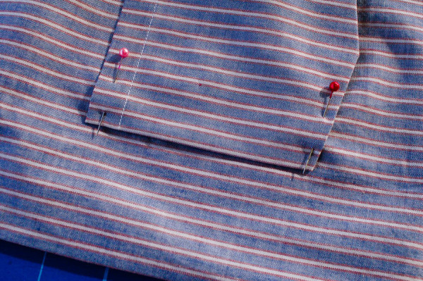
Sometimes choosing the space between stripes as your edge is easier than having a stripe line. For example, on the edge of the yoke, I chose to put the space instead of the white stripe, because it’s much harder to keep a narrow stripe on that edge when you’re sewing a seam. The wider the space, the more leeway you have. It’ll still look funny if the stripe is not parallel to the yoke line, but it’s better than seeing a narrow stripe get narrow and wide where it comes out of the seamline.
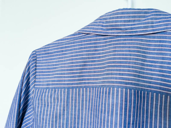
You can avoid some of these things by turning the stripes diagonally, on the bias. This looks especially cool in plaid fabrics. For the yoke you could add a center seam down the back and make the diagonal stripe lines meet for a chevron effect.
I sewed the buttons on with burgundy thread. I started with the buttons on the cuffs and thought it was awesome, so I sewed them all that way. Now that it’s done, it’s perhaps a little overkill.
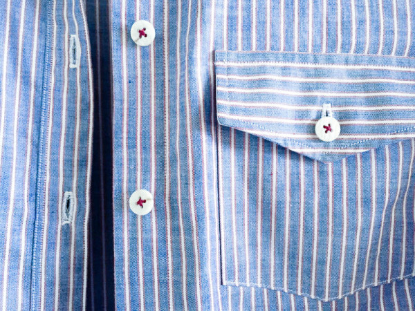
It’s rather businesslike, I quite like the effect!

I like the yoke cut so the stripes are across rather than down. And the suggestion of cutting it on a diagonal so that you get a chevron effect is fabulous!
I can’t take credit for the idea, it was in David Page Coffin’s shirtmaking book! Add a seam and line up the stripes. Maybe I’ll try that on another version!
I love this version!
Thanks!
Beautiful shirt, beautifully made. I don’t think the burgundy thread is overkill, it looks rather subtle to me.
Thanks! Maybe it’s just me looking too closely at it. It’s not that obvious when worn.
When I first started sewing making shirts seemed quite daunting, but they are now one of my favourite things to make. There is something so satisfying when you have sewn a perfect precise cuff or a crisp collar, I love it. The shirts I have made are also some of my most worn me made garments too. Love how you have used contrast fabric, makes it very menswear inspired :-)
I agree! Sewing shirts is so satisfying. It’s the precise, repetitive construction I love.
I have now made 4 Granville shirts and have fabric for 2 more. The last one I am wearing now, it’s a white with black plaid, sleeveless, and as I was making it I thought, shoot, I should have cut the yoke and collar and button band on the bias for interest. Luckily I have enough of the plain left to make a 2nd shirt, with long sleeves for the winter, and it will have the bias extras. I love this pattern so much! I’ve never made a pattern more than once, so this just shows how fantastic this shirt pattern is!
Thanks so much, I’m thrilled that you love the Granville shirt pattern so much to sew it four times! Yes, there’s a lot of options for plaids and stripes! One tip on cutting the button band on the bias – cut it longer than the finished centre front length. It can do weird things and shrink up, to avoid it cut yourself a couple of inches in extra length, then cut it off level with the lower edge before you hem it.
Beautiful! I love the contrast inner collar stand and cuff. The striping is perfect :)
Thank you! I thought it would be a neat way to incorporate contrast that wasn’t overly contrast-y.
Menswear shirts look quite elegant with white contrasting collar stands and cuff facings. However, if those shirts get lots of use, and the wearer sweats even normally, those white areas get dirty very fast. As a man who sweats and wears white shirts, I produce dirty, sweaty collars stands. For this reason, I personally chose not to use white as my contrast color, instead choosing a darker color or printed fabric.
Smart tip, John!